ShopDreamUp AI ArtDreamUp


Suggested Deviants


Suggested Collections


You Might Like…


Description
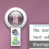
orb4 is a minimalistic theme for the litestep windows shell.
a little bit of history
user interface design
a little bit of history
user interface design
© 2006 - 2024 sryo
Comments44
Join the community to add your comment. Already a deviant? Log In
There are a few people I call genius and you are among them